Failing Forward: My Learnings with NFC Cards
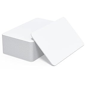
I ordered a pack of blank NFC cards from Amazon — white CR80 NTAG215 tags, the kind that promise “works with all NFC-enabled devices.”
I wanted the Dot / Blinq fantasy in my own app. Users can share contacts via NFC cards, for the sole purpose of the in person user experience does not forcibly break when exchanging contact information. Hoping for quick exchange for the conversation never breaks.
I added my phone number. Email. Name. and other details to the card. The app said success. The tag had data.
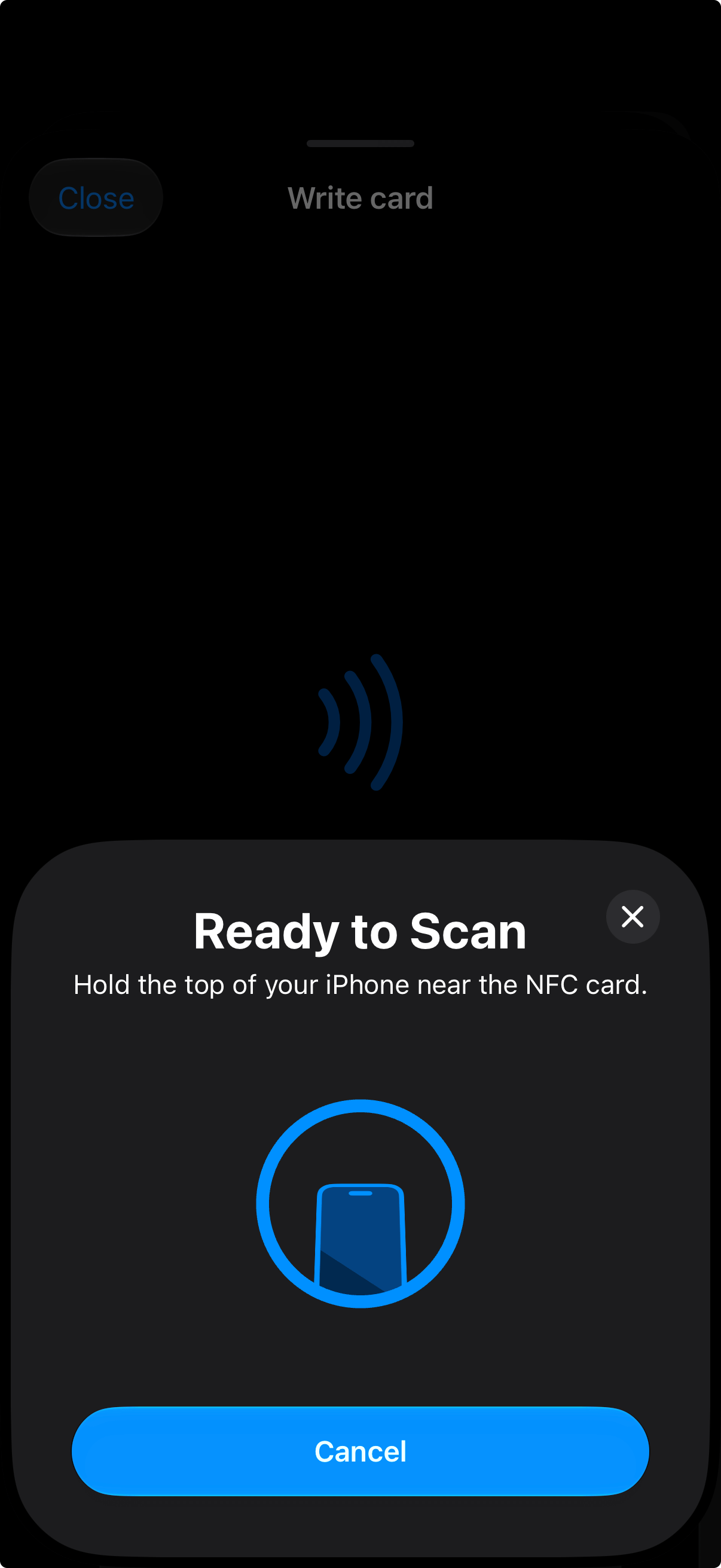
Then I tapped it with an iPhone.
Nothing.
No banner. No “Add Contact.” No error. Just silence — the worst kind of bug, because it looks like you didn’t do anything wrong.
That’s what this article journal entry: what I tried, what actually failed, and how it’s reshaping Contact Share.
The bet I made
Contact Share already shares via QR. The contact shows up beautifully on the other person’s phone. But that still means both of you pull out a device — I open the app and surface a code; they open the camera and scan. Friction is lower than typing, but it’s still there.
So I wanted to try NFC cards: reduce the dance so fewer phones have to come out, and the exchange is faster — closer to one person tapping a card than two people staging a QR ritual.
I felt like that was the next honest step for rooms where reducing friction matters: career fairs, mixers, anywhere the chat is the point.
I experimented and added “write to NFC” in the app:
Pick a persona’s contact fields.
Check whether the card can hold what I selected (different cards have different storage).
Write a compact contact file to the tag.
Tap → Add Contact.
On paper, that’s elegant. No server. No account. The card is the contact.
In the lab, writing worked. Detecting how much room was on the card worked. Shrinking the payload when it was too fat worked. The failure was after the data was already on the plastic.
What I thought the problem was
My first instinct: too much data.
That’s half true. NFC tags are tiny. Photos are out. Long addresses and a pile of social links fight for the same small space. I watched the size meter climb and learned to keep the card lean.
But “too much data” doesn’t explain a silent tap when the write verified and the payload was already small.
The sharper learning: iPhone, on a normal tap, does not treat “here’s my full contact” the way I wanted.
Apple is picky about what a background NFC tap will show. In practice, you’ll more often see things like:
A website link: (opens Safari / a notification)
A phone link: (opens Call)
An email link: (opens Mail)
A full contact file can sit on the tag correctly and still produce no system UI on iPhone. The OS isn’t “broken”; it’s policy. Android is often happier to offer Add Contact from the same card. I was optimizing for the wrong mental model: store the contact on the card vs store something the phone is willing to open.
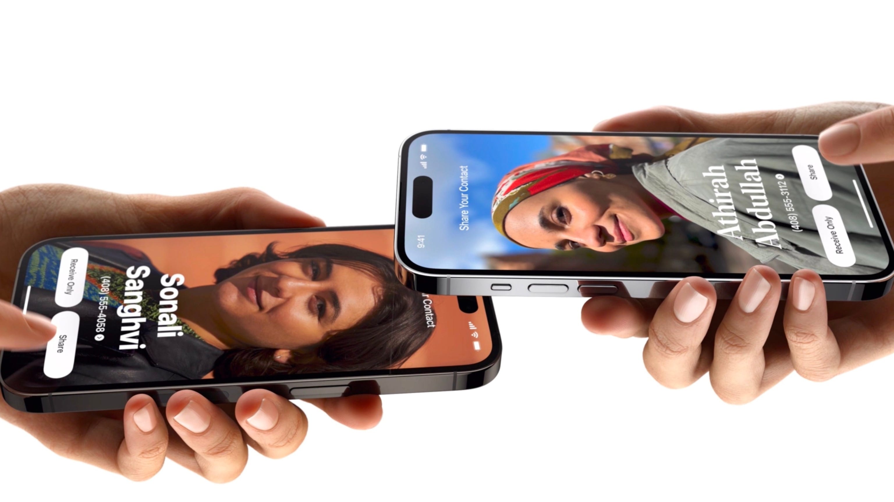
Name Drop and AirDrop are a different product. They’re Apple’s own peer-to-peer share between phones. An anonymous plastic rectangle in your wallet is not that system. I was asking a blank NFC card to behave like Name Drop. It won’t.
Key learnings
Write ≠ usable tap. “Success” in my writer UI only means the tag accepted the data. It does not mean every phone will react.
Storage is real. These cards are small. Trim hard. Maximize the space with as little as possible.
iPhone cares about a link first. For a banner without an app open, what matters is something Apple understands as a link — not a full contact dump.
Dot and Blinq look smarter in hindsight. Hardware + a short URL to a profile page isn’t laziness. It’s conforming to what iOS will actually show.
Local-only contact-on-plastic is a dead end for “tap to save” on iPhone. Better story on Android; incomplete for the phone I use for every day.
The pivot
I’m not abandoning NFC. I’m abandoning the fantasy that the entire contact lives only on the chip.
New shape — hybrid, closer to how Dot / Blinq work:
Cloud holds the shareable card (fields, persona, updates over time).
iOS app is the editor and the writer — it knows which persona, which link to stamp on the tag.
Web app / profile page is what the tap opens — a simple page where someone can download a contact file, save to Contacts, see what I meant to share.
NFC tag stores a URL (short, updateable destination) — not a kitchen-sink contact blob.
Pros: Works on iPhone background tap; card can change without rewriting plastic; richer than what fits on the chip; same link can power QR later.
Cons: Needs network for the “save contact” moment; I have to build hosting + a web surface; privacy and auth get real; offline tap becomes “open the link when you’re online.”
That’s fine. The hand-off I care about is still in the room. The plastic just becomes a pointer, not a database.
What I’m building next
In order, roughly:
Hosted profile URL per persona — the missing piece for NFC (and a cleaner QR story).
Web page that renders the card and offers Download contact.
Cloud sync so iOS and web agree on what’s shareable.
NFC writer v2 — stamp the profile link (keep a lean extra payload only if it still helps Android).
Rewrite the Amazon stack of blanks once the URL path is real — same cards, better contents.
Until that URL exists, NFC in Contact Share is a prototype of the writer, not the product promise of tap-to-save on iPhone. I’m saying that out loud so I don’t fool myself in demos.
Why this belongs in a build journal
I wanted a hardware win. I got a platform lesson.
Buying the cards was the easy part. Shipping “tap and they have me” means respecting Apple’s NFC surface — and joining the boring, correct architecture the incumbents already use: link on the tag, contact on the web.
Failure was useful. Silent failure was expensive. Writing it down is how I stop buying another pack of tags before the website exists.
Recap
I’m Luciano Huapaya. I’m building Contact Share in public — an iOS app to automate the contact hand-off so you can stay present when you meet people. Personas for what you share, Connections for who you meet, Events for where you met them. Not on the App Store yet. This is the journal of getting there.
Join My Newsletter
Follow along to see how we build mee.contact. The good, the bad, the ugly.
By subscribing, you’ll get new posts by email. Unsubscribe anytime.