Getting Started: The First Screen
I don’t start with a 20-page Product Requirements Document.
I start with a screen.
Not because specs are useless—later, when the idea has earned constraints, writing them down matters. Early on, the job is different: get the idea out of my head into something someone else can see.
A screenshot. A rough UX flow. A tapable demo. Anything that makes the value prop obvious faster than an essay about the value prop.
That’s my getting-started philosophy for Contact Share—and for this post.
Why images and flow beat extensive writing (at the start)
Extensive requirements docs optimize for alignment between people who already agree on the problem.
I often don’t. Not yet. The idea isn’t flushed out. “Ready” is a story I tell myself to delay showing something unfinished.
It’s easier to react to a picture than to negotiate language. Friends don’t argue with your glossary—they look at the screen and say, “I don’t get what I’m supposed to do,” or “Oh—that’s useful.”
That reaction is the product conversation I want. A polished requirements stack can wait until I know which branches are still alive.
Build the first screen to export the idea
“First screen” for me doesn’t mean App Store–ready UI.
It means the smallest visual contract with the idea. For Contact Share, that contract is simple:
Who I’m showing in this room.
How they get my info (QR / share).
Enough surface that the hand-off doesn’t need a side quest into Notes.
If someone can understand that in three seconds from a screenshot, the concept is out. If they can’t, no amount of accompanying prose will save it—I redesign the screen, not the adverb section of a document.
Pixels as communication. Not pixels as vanity.
The screenshot of the idea
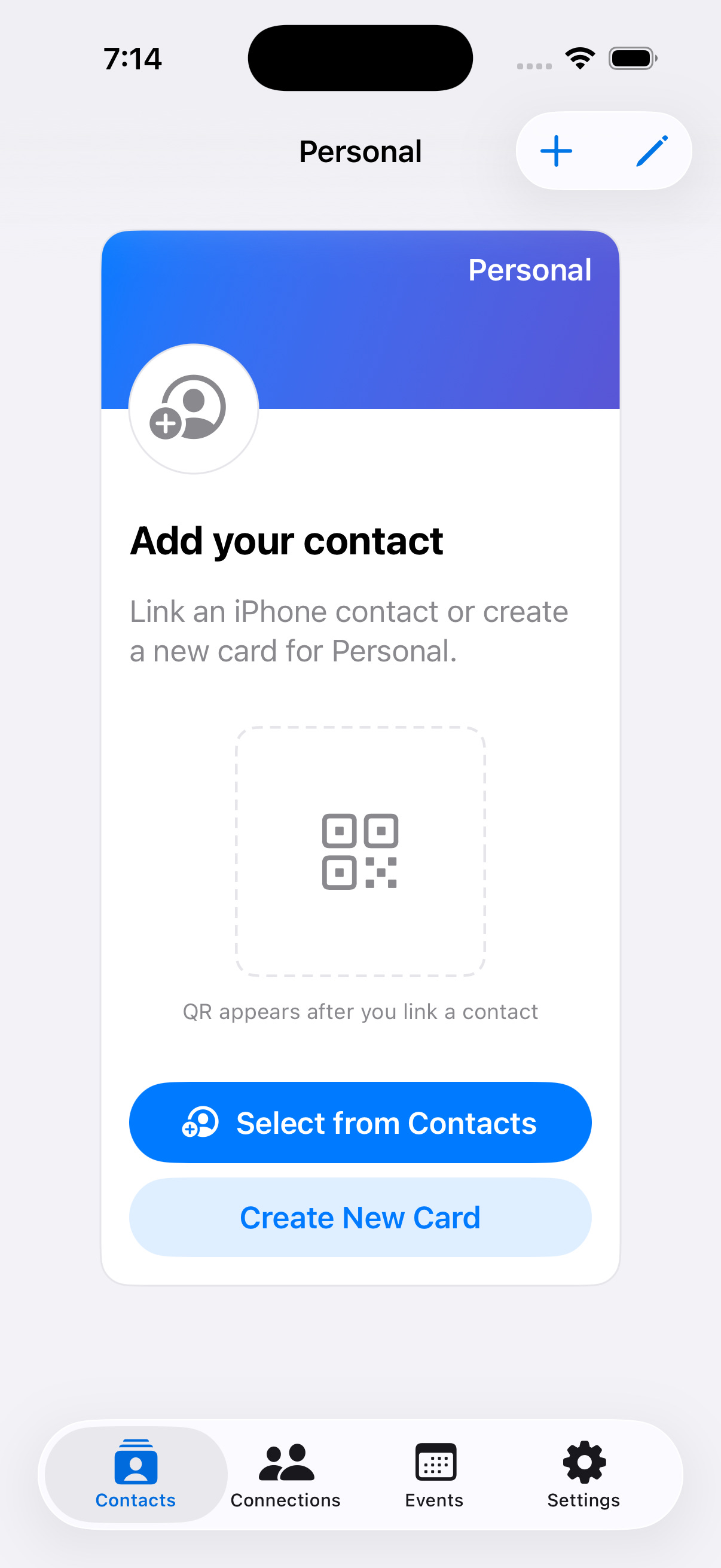
This is the contact card on the first screen—same chrome as a filled share card (brand band, avatar slot, QR inset, primary action). Here it’s still empty: no contact linked yet. That’s intentional. I’m showing the shape of the product before the fields are real.
What I want you to notice:
One clear job: This is the card you hand off, not a settings dashboard. The rest of the app (Connections, Events, Settings) stays in the tab bar; the center is the moment.
The value is readable in three seconds: Band + placeholder face + “QR appears after you link a contact” + Select from Contacts. Even unfinished, it’s “get me onto your phone without the typing theater.”
Room for iteration: Colors, copy, and what’s filled in will move; the moment (card → QR → share) has to survive first glance.
I’ll swap this asset as the product changes. The point of publishing it now isn’t “final design.” It’s feedback while nothing is ever really ready.
What I’m not rejecting
I’m not anti-documentation forever.
UX flows still matter: They’re the storyboard behind the screenshot.
Short written notes still matter: Problem, who it’s for, what we refuse to build.
PRDs and TRDs earn their place: When you’re coordinating, hiring, or locking a milestone.
I am rejecting the sequence that says: write everything → then allow a screen. For a solo founder with a half-formed bet, that sequence delays learning.
My sequence this season:
Screen / flow that shows the value prop.
Real reactions.
Writing that hardens what’s still true.
The Recap
I’m Luciano Huapaya. I’m building Contact Share in public—an iOS app to automate the contact hand-off so you can stay present when you meet people.
Shareable personas: Different cards for different contexts.
Connections: People you met, not just entries in your phone book.
Events: Grouping who you met where.
It’s not in the App Store yet. That’s part of the story you’re following.
Join My Newsletter
Follow along to see how we build mee.contact. The good, the bad, the ugly.
By subscribing, you’ll get new posts by email. Unsubscribe anytime.